5 Midcentury Modern Homes That Make the Most of Their Small Design
Posted in Houzz.com and Architecture by Houzz.com
Midcentury modern homes were small out of necessity. Money was in short supply after World War II, so architects and builders had to keep houses compact yet functional to stay within homeowners’ budgets. At the same time, lifestyles were changing. Smart architects took on a new approach and designed homes with an open feel, which differed greatly from the boxy designs of the previous era.
Related: Why You Should Embrace Your Midcentury Modern Kitchen

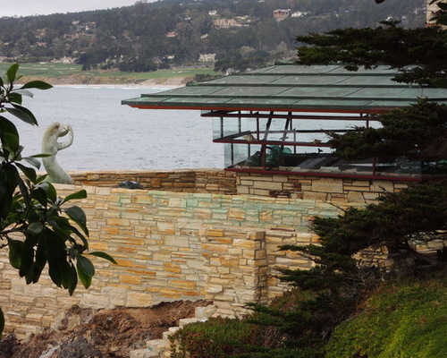
Midcentury Modern 1: Flavin Architects, original photo on Houzz
I’ve been enamored with midcentury modern homes since my childhood in California, where I was privileged to spend time in the intimate houses designed by Frank Lloyd Wright apprentice Mark Mills. Mills was the on-site architect for Wright’s famous Walker House, or Cabin on the Rocks, in Carmel, California, pictured. It was during this time that Mills learned an important lesson from Wright: Reject a larger house in favor of a modest home with flowing spaces and no excess.
The following ideas show how midcentury modern homes beautifully make the most of their space in ways that can easily be incorporated in homes today.

Midcentury Modern 2: Wheeler Kearns Architects, original photo on Houzz
1. Open floor plan.
Above all else, the open floor plan is the defining characteristic of midcentury modern homes. Closed-off rooms gave way to flowing spaces that strung one room to the next to form fluid kitchen, living and dining areas.
In a small home, the key to making the open floor plan work is to understand which rooms need privacy, and when. Of course, bedrooms and bathrooms need separation from the main areas of the home, but it’s also good to consider other areas that need privacy: for example, a study where a parent can work without interruption while the kids play nearby.
In this lake house by Wheeler Kearns Architects, the common areas are located in a centralized area, while the more private areas are off to the side or tucked away on another level.

Midcentury Modern 3: Balodemas Architects, original photo on Houzz
2. Expanded sightlines.
The tendency of midcentury modern homes to have open floor plans speaks to the elegant details often seen within these houses. Without trying to be too sparse, midcentury designers included functional details in their homes that were as uncomplicated as they were beautiful. Finding the balance between sophistication and openness was in the hands of the architect.
Take, for example, the stairs in midcentury modern homes. In this remodel of a midcentury home by Balodemas Architects, they preserved much of the original stair and design. The riser, or the vertical part that connects the stair treads, was simply left out for a lighter appearance. The stair was no longer in a hall but fully opened up and integrated into a room. Walls were often dispensed with entirely. Instead, partial-height screens inspired by Japanese shoji were used to subtly separate spaces.

Midcentury Modern 4: Steinbomer, Bramwell & Vrazel Architects, original photo on Houzz
3. An instance to avoid “open.”
While photographs of midcentury modern homes often feature great walls of glass, what’s often not shown, perhaps because they are not as photogenic, are the equally generous opaque walls.
These walls are key to the home’s aesthetic success. They provide a protective backing to the composition, since the opaque side of the home often faces the road, as with this house by Steinbomer, Bramwell & Vrazel Architects. Although the back of the house is open, with lots of glass and a sense of ease between inside and out, the street-facing side would never give that away. An opaque wall creates a boundary to the outside world while extending the perceived size of the home. Walls of glass are expensive, so opaque walls are also an economical design move.

Midcentury Modern 5: Flavin Architects, original photo on Houzz
4. Everything in its place.
Thoughtful storage is a another key aspect of what makes a small midcentury home completely livable. Most midcentury modern homes, particularly those on the West Coast, had no basements or attics, so storage closets needed to be located among the main living spaces. In part, the answer was to do more with less by having well-designed storage throughout and daily items close at hand, as in this kitchen. This has to be married to an ethic of keeping only what you need and having periodic yard sales.

Midcentury Modern 6: Koch Architects, Inc. Joanee Koch, original photo on Houzz
5. Display with a purpose.
In a small home with innovative but limited storage, it’s important to have display areas for the pieces that don’t need to be tucked away in drawers or closets. This was done beautifully in midcentury modern homes by integrating display areas as a means of aiding with the potential conundrum of scarce storage.
This restoration by Koch Architects shows this exact notion at work. Every other step in the stair has an integrated bookshelf. This would make a perfect rotating library with a range of titles easily seen while ascending the stair.
By Colin Flavin, Houzz
 Facebook
 X
X
 Pinterest
 Copy Link

